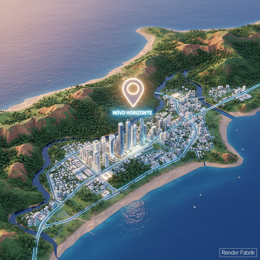
Map Animation 3D
Incorporadoras e loteadoras enfrentam um desafio crítico ao apresentar novos empreendimentos: como comunicar localização, contexto urbano e diferenciais de entorno de forma clara, atrativa e memorável? Plantas estáticas, mapas do Google Print e slides com ícones genéricos não transmitem a narrativa espacial necessária para converter leads qualificados em compradores decididos. É nesse cenário que a map animation emerge como ferramenta estratégica de marketing imobiliário, transformando dados geográficos e contextuais em experiências visuais dinâmicas que educam, engajam e aceleram a jornada de decisão de compra.
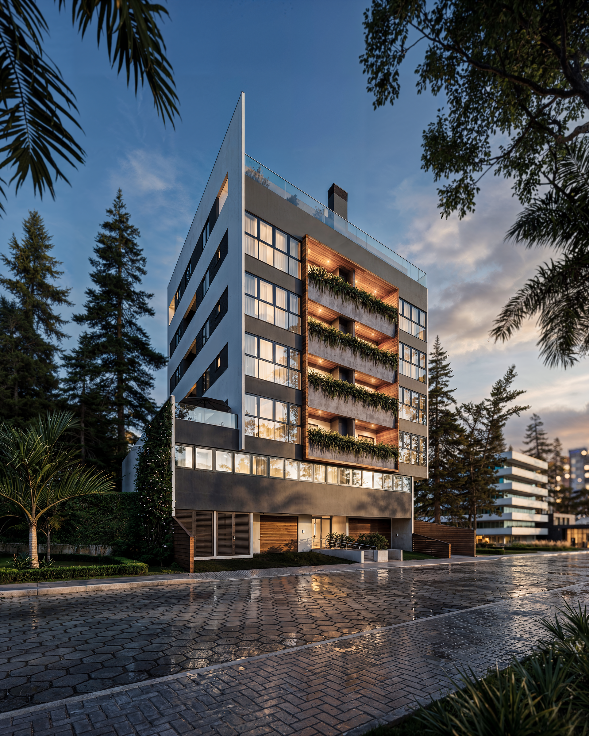
A animação de mapas 3D vai muito além de um recurso estético: trata-se de uma camada de inteligência visual que permite ao potencial comprador compreender, em segundos, a posição exata do empreendimento, distâncias reais para pontos de interesse (escolas, hospitais, shoppings, estações de metrô), malha viária, topografia e até mesmo o impacto de futuros desenvolvimentos urbanos. Em mercados competitivos como São Paulo, Rio de Janeiro, Belo Horizonte, Curitiba e Brasília, onde a escolha do bairro e da microlocalização pesa tanto quanto a qualidade do imóvel, a capacidade de narrar visualmente esse contexto define quem fecha negócio e quem perde oportunidades.
Este artigo técnico detalha o que é map animation, por que ela se tornou indispensável no lançamento de loteamentos e condomínios, como é produzida com rigor técnico e criatividade, quais os tipos mais eficazes para cada etapa do funil de vendas, faixas de investimento realistas, erros comuns que comprometem resultados e respostas diretas às perguntas mais frequentes de incorporadoras, construtoras e corretoras de alto padrão.
O que é Map Animation e Como Funciona na Prática
Map Animation (ou animação de mapa 3D) é uma peça audiovisual que utiliza modelagem tridimensional, cartografia digital e motion graphics para representar de forma animada a localização de um empreendimento imobiliário, seu entorno urbano, rotas de acesso, pontos de interesse e relações espaciais com infraestrutura crítica. Diferente de mapas estáticos ou screenshots de aplicativos de navegação, a animação permite movimentos de câmera cinematográficos, zoom progressivo, transições suaves entre escalas (região, bairro, quadra) e sobreposição de elementos gráficos — ícones, legendas, raios de distância, traçados viários — tudo sincronizado com narrativa visual ou trilha sonora.
Tecnicamente, a animação de mapa 3D é construída sobre bases cartográficas reais (dados de SIG, mapas oficiais, imagens de satélite) que são processadas, vetorizadas e extrudadas em software de modelagem 3D. Edifícios, relevo, vegetação e vias recebem volume e textura; a câmera virtual é animada frame a frame para conduzir o olhar do espectador pela narrativa espacial; e camadas de pós-produção (composição, correção de cor, tipografia animada) finalizam a peça. O resultado é um vídeo de 30 segundos a 2 minutos que funciona como argumento de vendas autônomo: pode ser incorporado em sites, enviado por WhatsApp, exibido em estandes de vendas, projetado em feiras e usado em campanhas de mídia paga.
A Render Fabrik produz map animation com foco absoluto em precisão cartográfica e clareza comunicacional — cada elemento animado existe para resolver uma dúvida específica do comprador e reforçar o posicionamento do empreendimento. Confira exemplos reais de animações de localização aplicadas a loteamentos, condomínios e empreendimentos mistos em nosso portfólio: renderfabrik.com/portfolio.
Por Que Map Animation é Estratégica para Lançamentos Imobiliários
A decisão de compra imobiliária é multifatorial, mas a localização permanece como um dos três pilares fundamentais — ao lado de preço e qualidade construtiva. Pesquisas de comportamento do consumidor imobiliário apontam que mais de 70% dos compradores priorizam proximidade a serviços, facilidade de acesso e valorização futura do bairro. No entanto, comunicar essas vantagens de forma convincente exige mais do que listar endereços em texto: é preciso mostrar, de maneira intuitiva e visualmente impactante, como a localização se traduz em qualidade de vida, economia de tempo e retorno de investimento.
A animação de mapa 3D resolve essa lacuna ao transformar dados geográficos abstratos em narrativa visual concreta. Quando o corretor exibe uma map animation no tablet durante a visita ao estande, o lead visualiza instantaneamente: "este loteamento fica a 8 minutos do principal shopping da região", "a estação de metrô está a 900 metros, caminhando", "o parque municipal é vizinho imediato". Essa clareza reduz objeções, encurta o ciclo de vendas e qualifica leads — quem assiste à animação já entende o contexto e pode focar em aspectos do produto (plantas, acabamentos, condições de pagamento) sem precisar voltar à discussão básica de localização.
Além disso, a map animation funciona como diferencial competitivo em mercados saturados. Em regiões metropolitanas como São Paulo, Rio de Janeiro, Belo Horizonte, Curitiba e Brasília, múltiplos lançamentos disputam atenção do mesmo público. A incorporadora que apresenta animação profissional de localização sinaliza profissionalismo, investimento em marketing e confiança no produto — atributos que aumentam a percepção de credibilidade e reduzem riscos percebidos pelo comprador. Muitas construtoras observam que peças de animação mapa 3D compartilhadas em grupos de WhatsApp e redes sociais geram maior engajamento (curtidas, comentários, compartilhamentos) do que posts estáticos, ampliando o alcance orgânico das campanhas.
Tipos de Map Animation e Suas Aplicações Táticas
1. Animação de Localização Regional (Zoom-In)
Este formato parte de uma visão ampla (estado, região metropolitana) e faz zoom progressivo até o terreno do empreendimento. É ideal para lançamentos em áreas de expansão urbana ou cidades médias, onde o comprador precisa primeiro entender a posição da cidade/região antes de avaliar o bairro. A animação destaca rodovias, aeroportos, entroncamentos e eixos de crescimento econômico, posicionando o empreendimento como ponto estratégico de conexão e desenvolvimento.
2. Animação de Entorno e Raio de Serviços
Foca em círculo de 1-3 km ao redor do empreendimento, destacando escolas, hospitais, supermercados, academias, farmácias, restaurantes e áreas de lazer. É o tipo mais usado em condomínios residenciais urbanos e loteamentos de médio padrão, onde a conveniência do dia a dia é argumento central. Ícones animados, legendas com distâncias em metros ou minutos e linhas de conexão entre o empreendimento e os pontos de interesse tornam a mensagem imediata.
3. Animação de Acessos e Conectividade
Enfatiza vias de acesso, estações de transporte público, corredores de ônibus, ciclovias e rotas para centros empresariais ou polos geradores de emprego. É estratégica para empreendimentos voltados a profissionais que trabalham em distritos financeiros (Faria Lima, Berrini, Centro do Rio, Asa Sul em Brasília) e precisam de deslocamento rápido. A animação pode simular trajetos, destacar tempos de percurso em diferentes horários e até sobrepor dados de mobilidade urbana.
4. Animação de Valorização e Desenvolvimento Futuro
Apresenta obras de infraestrutura planejadas ou em andamento (ampliação de avenidas, novos shoppings, estações de metrô, parques) que impactarão a valorização do empreendimento. É ferramenta poderosa para loteamentos em áreas de expansão, onde o comprador investe pensando em valorização de médio e longo prazo. A map animation pode usar linhas do tempo, antes/depois ou camadas que "acendem" mostrando os futuros desenvolvimentos.
5. Animação de Microlocalização e Topografia
Detalha o terreno do empreendimento, sua relação com ruas adjacentes, topografia (ideal para loteamentos em terrenos inclinados ou com vista privilegiada), orientação solar e ventilação. É técnica, usada em materiais de vendas para público qualificado e investidores que avaliam aspectos como valorização de lotes específicos, privacidade e aproveitamento do terreno. A Render Fabrik produz esse tipo de animação com precisão cartográfica, integrando dados de levantamento topográfico e projeto urbanístico — veja aplicações práticas em nosso portfólio.
Processo de Produção de Map Animation de Nível Profissional
A qualidade técnica e o impacto comercial de uma animação de mapa 3D dependem de um processo rigoroso que combina pesquisa cartográfica, modelagem 3D, motion design e pós-produção audiovisual. Entender essas etapas permite que incorporadoras e construtoras avaliem propostas, comparem fornecedores e participem ativamente do processo criativo.
1. Briefing e Definição de Objetivos
A produção inicia com alinhamento estratégico entre o estúdio e a equipe de marketing da incorporadora. Questões centrais: qual a mensagem prioritária da animação? O foco é conveniência, conectividade, valorização futura ou lifestyle? Qual o perfil do comprador (famílias, investidores, profissionais liberais)? Há diferenciais competitivos de localização que precisam ser evidenciados? Essa fase define o roteiro visual, duração, tom e pontos de interesse a serem destacados.
2. Coleta e Processamento de Dados Cartográficos
O estúdio obtém bases cartográficas oficiais (mapas municipais, dados de SIG, imagens de satélite de alta resolução), verifica precisão de coordenadas e identifica pontos de interesse validados. Ferramentas de geolocalização e bancos de dados públicos (IBGE, prefeituras, Google Maps API) são cruzados para garantir que distâncias, nomes de vias e posicionamento de serviços estejam corretos. Essa etapa é crítica: informações imprecisas comprometem a credibilidade da peça e podem gerar questionamentos de compradores.
3. Modelagem 3D e Texturização
Vias, quarteirões, terrenos e edifícios de referência (marcos urbanos, prédios icônicos) são modelados em 3D com volumetria realista. O terreno do empreendimento recebe destaque visual (cor diferenciada, iluminação focal, contorno destacado). Vegetação, relevo, corpos d'água e elementos urbanos (postes, mobiliário urbano) são adicionados para contextualização. A texturização usa cores neutras e legibilidade — o objetivo é informar, não distrair.
4. Animação de Câmera e Movimento
A câmera virtual é animada seguindo o roteiro: movimento de zoom-in (do geral ao específico), travelling (deslocamento lateral para mostrar entorno), rotação orbital (visão 360° do empreendimento) ou combinação de movimentos. A velocidade é calibrada para conforto visual — transições muito rápidas desorientam; lentas demais perdem atenção. Keyframes (quadros-chave) definem início, meio e fim de cada movimento, com interpolação suave entre eles.
5. Motion Graphics e Elementos Informativos
Ícones animados (escola, hospital, shopping), legendas com distâncias, linhas de conexão, raios de abrangência e call-outs são inseridos sincronizados com o movimento da câmera. Tipografia clara, hierarquia visual (informações prioritárias em destaque) e identidade visual do empreendimento (logo, cores da marca) são aplicadas. Esta camada transforma a animação de um vídeo bonito em uma ferramenta de vendas funcional.
6. Pós-Produção e Finalização
Correção de cor, ajuste de iluminação, adição de trilha sonora (quando aplicável) e exportação em resoluções otimizadas para diferentes canais (Full HD para web, 4K para projeções em estandes). A Render Fabrik entrega map animation em múltiplos formatos: versão completa (60-120 segundos), versão resumida (15-30 segundos para redes sociais) e versão sem áudio (para exibição em loops em estandes). Revisões são feitas com base em feedback da incorporadora, garantindo que a peça final esteja alinhada com a estratégia comercial — solicite uma demonstração do nosso processo em renderfabrik.com/portfolio.
Faixas de Investimento e Prazos Realistas para Map Animation
O investimento em animação de mapa 3D varia conforme complexidade técnica, extensão da área mapeada, quantidade de pontos de interesse, nível de detalhamento da modelagem 3D e duração final da peça. Não existe "preço fixo" — cada projeto é único —, mas é possível estabelecer faixas de referência para planejamento orçamentário.
Animações básicas de localização, com foco em uma única visão (zoom-in ou raio de serviços), duração de 30-45 segundos, modelagem simplificada e até 10 pontos de interesse, tendem a se posicionar na faixa mais acessível do mercado. São adequadas para loteamentos de entrada ou empreendimentos em regiões consolidadas, onde a localização já é conhecida e a animação funciona como reforço visual.
Animações intermediárias, com múltiplos movimentos de câmera, duração de 60-90 segundos, modelagem 3D mais detalhada (incluindo marcos urbanos reconhecíveis), 10-20 pontos de interesse e camadas de motion graphics elaboradas (raios de abrangência, linhas de transporte, legendas animadas), representam o padrão de mercado para lançamentos de médio e alto padrão. Esse nível oferece equilíbrio entre impacto visual e custo, sendo amplamente adotado por incorporadoras regionais e nacionais.
Animações premium, com narrativa visual sofisticada, duração de 90-120 segundos, modelagem 3D hiper-realista (texturas fotorrealistas, vegetação volumétrica, iluminação dinâmica), integração com dados de mobilidade urbana, simulação de trajetos e cenários futuros (desenvolvimento urbano), são investimentos estratégicos para empreendimentos de alto padrão, loteamentos de grande porte ou projetos mistos (residencial + comercial) onde a localização é argumento central de posicionamento. Nessa faixa, a map animation pode incluir versões personalizadas para diferentes públicos (investidores, moradores, comerciantes) e integração com tours virtuais 360°.
Os prazos de produção variam entre 10 e 30 dias úteis, dependendo da complexidade. Animações básicas podem ser entregues em 10-15 dias; intermediárias em 15-20 dias; premium em 20-30 dias. Prazos incluem coleta de dados, modelagem, animação, revisões e finalização. Projetos urgentes podem ser acelerados mediante planejamento antecipado e priorização na fila de produção — consulte a Render Fabrik para orçamento personalizado e cronograma detalhado.
Aplicações Práticas de Map Animation no Ciclo de Vendas
A versatilidade da animação de mapa 3D permite que seja aplicada em múltiplos pontos de contato com o potencial comprador, maximizando retorno sobre investimento e acelerando a conversão de leads.
Estandes de Vendas e Plantões: Exibida em telas de TV ou projetores, a map animation funciona como argumento visual permanente, rodando em loop e atraindo atenção de visitantes. Corretores usam a animação como introdução à apresentação, criando contexto antes de mostrar plantas e decorados. É especialmente eficaz em lançamentos de loteamentos, onde o comprador precisa primeiro "ver onde fica" antes de avaliar lotes.
Sites e Landing Pages: Incorporada na seção "Localização" do site do empreendimento, a animação mapa 3D reduz taxa de rejeição e aumenta tempo de permanência na página — métricas que melhoram ranqueamento em buscadores. Vídeos tendem a gerar maior engajamento do que mapas estáticos, incentivando o lead a preencher formulários ou iniciar contato via WhatsApp.
Campanhas de Mídia Paga (Facebook, Instagram, YouTube): Animações de 15-30 segundos otimizadas para redes sociais geram taxas de clique superiores a anúncios estáticos. O formato em vídeo é favorecido pelos algoritmos, ampliando alcance orgânico. Call-to-actions claros ("Agende sua visita", "Baixe a planta", "Fale com um corretor") convertem visualizações em leads qualificados.
Apresentações para Investidores e Parceiros: Em reuniões com fundos de investimento, bancos financiadores ou parceiros comerciais, a map animation demonstra profissionalismo e reforça o posicionamento estratégico do empreendimento. A narrativa visual facilita a compreensão de diferenciais competitivos e potencial de valorização, acelerando negociações.
Feiras e Eventos do Setor: Em feiras imobiliárias regionais ou nacionais, onde múltiplos expositores competem por atenção, a exibição de animação de mapa 3D em telas de LED ou totens digitais diferencia o estande, atrai público qualificado e facilita a abordagem da equipe de vendas. A Render Fabrik produz animações otimizadas para diferentes formatos de tela e ambientes de exibição — veja exemplos aplicados a eventos em renderfabrik.com/portfolio.
Tabela Comparativa: Map Animation vs. Métodos Tradicionais de Comunicação de Localização
| Critério | Map Animation 3D | Mapa Estático (Google Maps Print) | Slides com Ícones |
|---|---|---|---|
| Impacto Visual | Alto — movimento, profundidade, narrativa cinematográfica | Baixo — imagem estática, sem hierarquia visual | Médio — depende da qualidade do design gráfico |
| Clareza de Informação | Excelente — guia o olhar, destaca pontos prioritários | Razoável — requer interpretação do espectador | Boa — mas pode ficar poluído com muitos ícones |
| Engajamento (web e redes sociais) | Alto — formato vídeo favorecido por algoritmos | Baixo — imagens estáticas geram menos interação | Médio — depende de copywriting e CTA |
| Versatilidade de Uso | Múltiplos canais (site, redes, estande, feiras, e-mail) | Limitado — funciona melhor impresso ou em PDFs | Médio — bom para apresentações, limitado em mídias digitais |
| Percepção de Profissionalismo | Muito alta — sinaliza investimento e qualidade | Neutra — recurso básico esperado | Variável — depende da execução gráfica |
| Custo de Produção | Investimento superior, mas com ROI mensurável | Baixo (gratuito ou custo mínimo de design) | Baixo a médio (depende de designer gráfico) |
| Capacidade de Narrar Valorização Futura | Excelente — animação temporal, antes/depois, cenários | Inexistente — mostra apenas estado atual | Limitada — requer texto explicativo adicional |
Checklist: Como Avaliar a Qualidade de uma Map Animation Antes de Contratar
- Precisão cartográfica: Verifique se o estúdio utiliza bases oficiais e valida distâncias e posicionamento de pontos de interesse. Erros comprometem credibilidade.
- Clareza da narrativa visual: A animação deve contar uma história (do geral ao específico, por exemplo), não apenas mostrar elementos desconectados.
- Qualidade técnica da modelagem 3D: Verifique resolução, texturização, iluminação e suavidade de movimentos de câmera. Animações "travadas" ou com baixa resolução prejudicam a percepção de qualidade.
- Hierarquia de informações: Os elementos mais importantes (o empreendimento, acessos principais, serviços prioritários) devem ter destaque visual claro — cor, tamanho, posição na tela.
- Identidade visual consistente: Cores, tipografia e logo do empreendimento devem estar integrados de forma harmônica, reforçando branding.
- Versatilidade de formatos: O estúdio deve entregar versões em diferentes durações (completa, resumida) e resoluções (Full HD, 4K), otimizadas para web, redes sociais e projeções.
- Trilha sonora e locução (quando aplicável): Áudio deve ser profissional, com mixagem equilibrada e compatível com o tom da marca. Peça versões com e sem áudio para flexibilidade de uso.
- Prazo de revisões: Confirme quantas rodadas de ajustes estão incluídas no orçamento e como são tratadas solicitações de mudanças fora do briefing original.
- Portfólio comprovado: Solicite exemplos anteriores de map animation produzidos para empreendimentos similares. Avalie se o estúdio tem experiência no segmento (loteamentos, condomínios, comercial).
- Suporte pós-entrega: Verifique se o estúdio oferece suporte para adaptações futuras (inclusão de novos pontos de interesse, mudanças de logo, versões em outros idiomas para empreendimentos internacionais).
Erros Comuns na Produção e Uso de Map Animation
Mesmo com a crescente adoção de animação de mapa 3D no mercado imobiliário brasileiro, muitas incorporadoras cometem erros que reduzem a eficácia da ferramenta ou comprometem o retorno sobre investimento. Conhecer essas armadilhas permite evitá-las e maximizar resultados.
Erro 1: Informações imprecisas ou desatualizadas. Usar distâncias aproximadas ("perto do shopping") sem validação, mostrar pontos de interesse que já fecharam ou citar acessos ainda não inaugurados gera desconfiança. O comprador descobre a imprecisão durante visita ao local e questiona a credibilidade de toda a comunicação da incorporadora. Solução: trabalhar apenas com dados validados e atualizar animações quando houver mudanças significativas no entorno.
Erro 2: Excesso de informações e poluição visual. Tentar mostrar "tudo" em uma única animação — 30 ícones de serviços, múltiplas rotas, legendas sobrepostas — confunde o espectador e dilui a mensagem central. Menos é mais: priorize 5-10 pontos de interesse realmente relevantes para o público-alvo e destaque-os com clareza. Informações secundárias podem estar em materiais complementares (PDF, site).
Erro 3: Produção amadora ou de baixa resolução. Contratar freelancers sem experiência comprovada ou usar templates genéricos resulta em animações "quadradas", com movimentos bruscos, texturas pixeladas e tipografia ilegível. A economia inicial se transforma em prejuízo quando a peça não gera engajamento ou, pior, passa impressão de produto de baixa qualidade. Investir em estúdio especializado, como a Render Fabrik, garante resultado profissional que realmente converte — confira a diferença técnica em renderfabrik.com/portfolio.
Erro 4: Duração inadequada para o canal de distribuição. Produzir apenas uma versão de 2 minutos e tentar usá-la em anúncios de Facebook (onde 15 segundos é o ideal) desperdiça potencial de alcance. A solução é planejar desde o briefing: versão completa para site e estande, versões curtas (15-30 segundos) para redes sociais, versão sem áudio para loops em telas de TV em ambientes públicos.
Erro 5: Não integrar a map animation na estratégia omnichannel. Produzir uma peça excelente e usá-la apenas no estande de vendas é subutilizar o investimento. A animação mapa 3D deve estar no site (página de localização e home), nas redes sociais (posts orgânicos e anúncios pagos), em e-mails de nutrição de leads, em apresentações para corretores e em feiras do setor. Cada ponto de contato amplifica o impacto e reforça a mensagem de localização estratégica.
Perguntas Frequentes sobre Map Animation (FAQ)
1. Quanto tempo leva para produzir uma map animation profissional do zero?
O prazo médio de produção de uma animação de mapa 3D varia entre 10 e 30 dias úteis, dependendo da complexidade técnica e da quantidade de pontos de interesse a serem destacados. Animações básicas com foco em raio de serviços simples e duração de até 45 segundos tendem a ficar prontas em 10-15 dias. Projetos intermediários, com múltiplos movimentos de câmera, modelagem detalhada e motion graphics elaborados, demandam 15-20 dias. Animações premium, que incluem cenários de desenvolvimento futuro, integração com dados de mobilidade e narrativas complexas, podem exigir 20-30 dias. O prazo considera coleta e validação de dados cartográficos, modelagem 3D, animação, inclusão de elementos gráficos, revisões e finalização em múltiplos formatos. Projetos com prazos mais curtos podem ser negociados mediante planejamento antecipado e priorização na fila de produção do estúdio.
2. É possível atualizar uma map animation se houver mudanças no entorno do empreendimento?
Sim. Uma das vantagens da map animation produzida com processo estruturado é a possibilidade de atualizações pontuais sem necessidade de refazer toda a peça. Se um novo shopping for inaugurado, uma estação de metrô entrar em operação ou uma via de acesso for ampliada, o estúdio pode incluir esses novos elementos na animação existente, ajustar legendas e reexportar o vídeo atualizado. O custo de atualização é proporcional à extensão das mudanças — inclusão de um ou dois pontos de interesse tem custo bem inferior à produção original. É recomendável manter contato com o estúdio que produziu a animação inicial, pois ele já possui os arquivos de projeto (modelos 3D, bibliotecas de texturas, configurações de câmera), o que agiliza e barateia o processo de atualização. A Render Fabrik oferece suporte pós-entrega para ajustes e atualizações em animações de mapa 3D produzidas para incorporadoras parceiras.
3. Map animation funciona bem para loteamentos rurais ou em cidades pequenas?
Absolutamente. A animação de mapa 3D é especialmente estratégica para loteamentos rurais, chácaras de lazer, condomínios em áreas de expansão urbana ou cidades pequenas e médias, onde o potencial comprador — muitas vezes residente em grandes centros — não conhece a região e precisa de contextualização espacial clara. Nesses casos, a map animation deve priorizar: distância e tempo de deslocamento até cidades-polo ou capitais estaduais; acesso por rodovias (mostrando trajeto e condições de pavimentação); proximidade a pontos de apoio (postos de gasolina, mercados, serviços de saúde); atrativos naturais (rios, montanhas, áreas de preservação); e diferenciais de infraestrutura local (energia elétrica, água tratada, internet). A narrativa visual ajuda o comprador urbano a avaliar se o empreendimento atende suas expectativas de refúgio, investimento ou transição para vida no interior, reduzindo objeções e acelerando decisões de compra.
4. Qual a diferença entre map animation e tour virtual 360°? Posso usar os dois juntos?
São ferramentas complementares com propósitos distintos. A map animation foca em localização e contexto urbano — mostra onde o empreendimento está, como se relaciona com o entorno e por que a posição é estratégica. Já o tour virtual 360° permite que o usuário "caminhe" virtualmente dentro do decorado, do empreendimento ou entre lotes, explorando ambientes em primeira pessoa e com interação. Usar ambos é altamente recomendado para campanhas de lançamento, pois atendem diferentes momentos da jornada de compra: a map animation atrai atenção, gera interesse e qualifica leads ao mostrar a localização; o tour virtual 360° aprofunda o desejo e permite avaliação detalhada do produto, acelerando a decisão. A Render Fabrik produz ambas as soluções de forma integrada — a animação de mapa pode incluir link direto para o tour virtual, criando experiência imersiva completa. Confira exemplos de projetos que combinam map animation e tour 360° em nosso portfólio.
5. Como medir o retorno sobre investimento (ROI) de uma map animation?
O ROI de animação de mapa 3D pode ser mensurado por meio de métricas quantitativas e qualitativas ao longo do ciclo de vendas. Métricas quantitativas incluem: taxa de conversão de leads que assistiram à animação versus aqueles que não tiveram contato com a peça (rastreável via códigos UTM em landing pages ou links específicos); tempo médio de permanência na página de localização do site (animações aumentam engajamento e reduzem rejeição); número de compartilhamentos e comentários em posts com a animação em redes sociais (alcance orgânico amplificado); taxa de cliques (CTR) em anúncios pagos com vídeo versus anúncios estáticos; e redução do ciclo de vendas (tempo entre primeiro contato e fechamento de negócio, já que a animação qualifica leads e reduz objeções). Métricas qualitativas incluem feedback de corretores (relatos de que a animação facilita apresentações e reduz dúvidas sobre localização); percepção de profissionalismo por parte de investidores e parceiros; e diferenciação competitiva em feiras e eventos. Incorporadoras que implementam rastreamento estruturado — usando ferramentas como Google Analytics, CRM imobiliário e pesquisas pós-venda — observam que materiais audiovisuais de qualidade profissional, como map animation, tendem a contribuir significativamente para a aceleração de vendas e melhoria da percepção de marca.
Conclusão: Map Animation como Investimento Estratégico em Marketing Imobiliário
Em um mercado imobiliário brasileiro cada vez mais competitivo e digital, onde o comprador inicia sua jornada online, pesquisa múltiplas opções simultaneamente e exige transparência absoluta antes de agendar uma visita, a capacidade de comunicar localização de forma clara, impactante e memorável deixou de ser diferencial para se tornar requisito mínimo de competitividade. A map animation atende essa demanda ao transformar dados cartográficos abstratos em narrativa visual que educa, engaja e converte — reduzindo objeções, qualificando leads e acelerando decisões de compra.
Incorporadoras, loteadoras e construtoras que investem em animação de mapa 3D profissional ganham vantagem competitiva mensurável: maior engajamento em campanhas digitais, melhor percepção de credibilidade, facilidade na abordagem comercial dos corretores e diferenciação em feiras e eventos. Mais do que uma peça de marketing, a map animation é ferramenta de inteligência comercial que permite comunicar, de forma objetiva e visualmente atrativa, por que determinada localização representa oportunidade única de investimento, qualidade de vida ou valorização patrimonial.
A Render Fabrik é especialista em produção de map animation para o mercado imobiliário brasileiro, com processo técnico rigoroso que combina precisão cartográfica, criatividade narrativa e excelência em motion graphics. Atendemos incorporadoras de pequeno, médio e grande porte em São Paulo, Rio de Janeiro, Belo Horizonte, Curitiba, Brasília e demais regiões do país, entregando animações otimizadas para múltiplos canais (site, redes sociais, estandes, feiras, apresentações corporativas) e com suporte completo desde o briefing até a pós-entrega.
Se sua incorporadora está lançando loteamento, condomínio residencial ou empreendimento de uso misto e precisa comunicar localização de forma profissional e impactante, conheça nosso portfólio de map animation em renderfabrik.com/portfolio e solicite orçamento personalizado. Transforme a localização do seu empreendimento em argumento de vendas irresistível com animações 3D que realmente convertem.